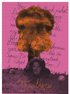

The real question is should I blow up the high school or Wynona Ryder?
I think the colors work better with Wynona because that image is darker, and the orange type doesn't get lost like it does with the high school. Personally, I'm leaning towards Wynona. Should I make those croquet balls orange?
Winona head is the winner by far. This looks fantastic, and the color choices are fantastic. Really nice work, Allison!
ReplyDeleteStill not a huge fan of the angled type. Run it horizontally, and I think you've got a really strong solution.
The title is well-resolved, and it really ties the note together.
If you're printing on white with a margin, what happens if you bring white into your composition? Perhaps the note type?
Type on top of image is working much better in the second poster. Lose the school, keep Winona's head!
Nicely done!
I agree with Ryan that the color choices are good, but the orange is a little hard to read - maybe it should be a tad bit lighter?
ReplyDeleteThe Winona one is really great. The color definitely makes a huge difference in your poster, but I'm having a hard time reading the "Heather's" title. Try different ways to amp up the readablility. Either through stroke weight, color, etc.
ReplyDelete