Hey guys,
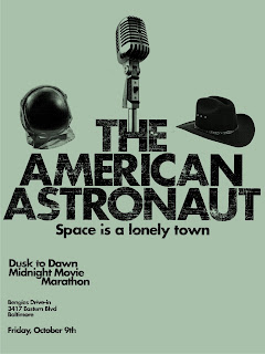
So I roughed up the type a little bit, and played around with moving 'marathon' around as was suggested. I also gave the hats a little more breathing room. I'm not sure what it needs, but I feel like it needs just one more thing- any suggestions?
The roughed up type adds such a nice lively touch and dimension to this. But, I don' think it's necessary for it to be applied in the secondary text. nice work
ReplyDeleteTitle is much improved. You could also use this space to use the lunar image (within the type) to add actual relevant detail to your image.
ReplyDeleteThe secondary type breaks your centered system, and it's jarring by comparison. There is a big dead space created at the bottom right that overemphasized.
I don't know if the mic stand needs to go right into the space in the "h". You can probably just stop it above the x-height.
The helmet and cowboy hat feel a bit tight to the type. Perhaps they can both lift just a bit to ease the claustrophobic feel.
Love the color, btw.