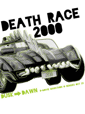
Here's my latest version, I tried putting it at an angle. I'm pretty happy with that, but I still need to work on the type. I think I'm going to try hand drawing it later today. I'm having some issues with In Design though, when I try to change the color of an object the swatches go grey and I can't do anything but change the color of the outline of the rectangle surrounding it. Does anyone know why it's doing this?
This looks so BOMB. It's amazing how just tilting your composition makes it so much better and adds that whole element of movement.
ReplyDeleteI think the negative space is working pretty well too, I just wish that the negative spaces were a little more similar. Maybe adding another line of text under dusk to dawn, like the address or something, would help that.
As for the type, I wish there was some green in the title. That color really pops, so one of the first things I look at is the dusk to dawn type, which probably should not be at the top of the list. maybe make the counterforms in the title green? That might be stupid. Maybe just all green.
But all in all, so dope.
Really interesting take, and the angle definitely helps.
ReplyDeleteIn terms of the title, it does need a hand element to make it work.
It's just a bit tight on the right hand side, and could use some more negative space to let it breathe. Reducing the overall composition by 5-10% would probably do this.
Color is great, love the green.
Lastly, the title doesn't sit as well as the supporting information (tertiary info). Have you tried running it as a line, and placing it under the cars tires, with the rest of the info running under it?
This might help resolve the title placement issue, and also reinforce the threatening dynamic of the car.
Keep pushing this, almost there!
The car is looking really great! The angle adds a lot of action which is perfect for the movie. Remember to consider the negative space you're creating as you place your type. Right now, especially under the car, my eye is gravitating towards the different white spacing instead of reading the text. Overall, it's nice progress.
ReplyDelete