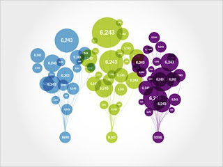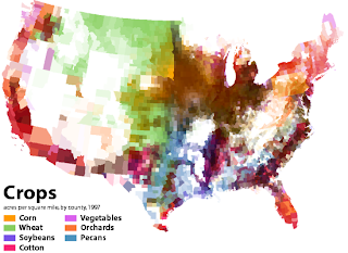

This first infographic depicts google search results, broken down into 3 categories (news, blogs, social). The second represents the distribution of types of crops throughout the U.S. And the third, which I thought was really interesting, is an interactive timeline of all the movies released since 1986. Width is based on weekly box office revenue, length is longevity, and they are colored according to the total amount of money made.
Topic: How dependent I am on technology
Subcategories:
1. cell phone (texting)
2. email
3. social networking
4. ipod/ music
5. movies
I would also like to explore the usages of techonolgy. For example, how often I use it for work, entertainment, and communication (and communication can then be broken down into whether it is instant or delayed). And also looking at how often I multitask (ie listening to music while chatting with someone online)

Good research. All of your examples use color in a really informative and precise way.
ReplyDeleteTechnology is a great topic, and it's also huge, so cut a manageable slice out of it, and make your category/sub-categories really clear.