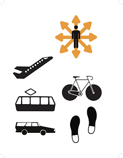
I am thinking about getting rid of the whole arrow motif all together just to make my pictograms simpler, that way they only symbolize one simple thing when it comes to creating the more complex infographics. I am a little worried that my overall transportation icon sticks out now because it's the only one with arrows...
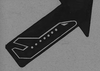
I also attached a sketch with a bold arrow behind the picto just to give you an idea of what they look like with an arrow behind.


These are starting to come together. Be aware of how you utilize linework and detail, and try to be consistent throughout. For instance, there is really nice use of interior line on your bike pictogram, and by contrast, your light rail pictogram feels a bit understated by comparison. Can you bring any additional detail in to resolve the set?
ReplyDeleteUse of sideview to harmonize helps these. I think the plane could use the wing in the foreground as well.
Your overall pictogram for your set is working better as well. I'd consider making it more personal and stylized, it's a bit too familiar right now, and you've made nice progress on all your others.
I'm uncertain if the feet integrate with the rest of these. Consider how they relate, and if it would work better to utilize the human figure here.
Nice work, set is coming together.