Saturday, October 31, 2009

Graph


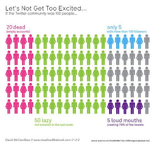
I wanted to play around with the Illustrator Graph Capabilities as I'm more Interested in using graphs as visualization more so than my pictograms.

This is a pretty basic one as it was my first, but any feedback on Color, Style, Type, layout would be great. Also if anyone knows other programs for creating graphs.

Happy Halloween!

Thursday, October 29, 2009

Pictos


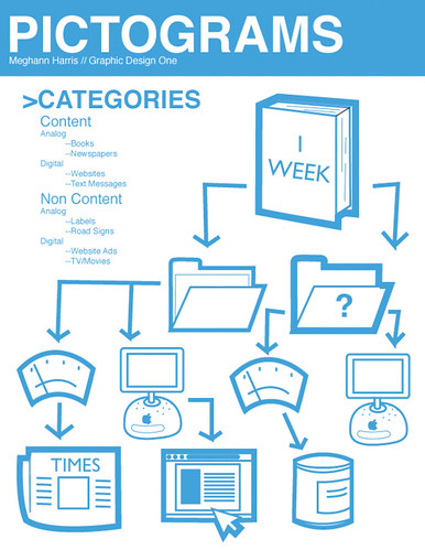
Pictograms for you!

Alan Pictograms

The money pictogram is not my main pictogram. I just forgot to put it on the same page as the rest. The clock with the Utensils is my main pictogram. It symbolizes time consumption.

pictograms

The convenience of technology; social networking; email; music (ipod); texting; movies

James_ Pictograms

pictograms


I still need to add/ work on some of these, feedback would be much appreciated.

Entertainment


WHAT I EAT (not supposed to be a severed hand...)

WHERE IT COMES FROM

TIME

SATISFACTION

COST

NUTRITION

I never realized how completely unskilled I am with Illustrator until I did these... Any comments/tips would be great!

My sketches so far.


Category: Food

Sub Categories:
1. Where it comes from
-Homemade
-Eating out

2. Time
-What times during the day I eat.
-what this means in relation to my state of mind/mood at the moment.
-How long it takes me to eat.
-if I'm in a rush, I'll scarf the food down.
-if I have time, I'll savor the flavors.

3. Emotions evoked by certain dishes.
-Feelings of nostalgia. (I chose this because I almost always have nostalgic feelings when I eating anything. Not sure why, I just know I do.)

4. People
-Do I prefer to eat with someone or by myself?
-depending one what I eat, do I want to share or not share?

5. Cost
-How much I spend on individual meals.
-How much I spend on food in a week.

Wednesday, October 28, 2009

Pictograms for tomorrow

Hey guys! I'm bringing in this sheet to show everyone tomorrow, but this is my list of categories and a bunch of the pictograms that I made, so check em out :). Responses are welcome because I'll be reading them to improve some of the stuff so please and thank you!

Categories

What I eat

1. Where it comes from
-Homemade
-Restaurant
-School dining

2. Cost
-Total cost of eating for one week
-Eating out vs cooking

3. Time
-How long did it take in relation to how delicious it was?
-Average time spent on cooking/getting food

4. Amount of satisfaction/How delicious was it really?
-How does this relate to where it comes from?

5. Food groups
-new food pyramid vs old food pyramid and which makes me look healthier

Some Info Graphs. . .


Categories

Things that i did for other people. . .

1. Work
- departments
-customers
-co workers
- Importance

2.Family
-who it was
-what it was
-importance to the family member

3. Friends
- Who it was
-What it was
-Importance/ level of appreciation

4.Random People
-What it was
-Importance / level of appreciation

5. What I did for myself/ what people did for me
- who it was
- What they did
- Importance it was to me / level of appreciation

categories

Here is the categories I think I'm going to be working with.

Distractions:
1. Movies
a. what movies
b. genres
c. for how long
2. Internet
a. what sites
b. how many times visited (possibly)
c. for how long
3. Eating
a. the different foods I ate
b. times I ate
c. for how long
4. Naps
a. how long
b. if I have memorable dreams
c. where
-what furniture
5. Play
a. kendama
b. hanging out/chillin/talking
c. family
d. and how long for each.

I was also thinking that these would somehow contrast the things I recorded under the work category.

Infographics Research

I found a website - "40 Useful and Creative Infographics" at "http://sixrevisions.com/graphics-design/40-useful-and-creative-infographics/. They had a bunch of cool stuff on there. I will post a few examples.

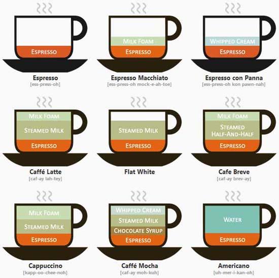
Since I work at Starbucks...


And then there's the guy who does Wall Stats - some of you might remember his Obama poster.
http://wallstats.com/389yearsago/
I love these posters.


Here's a cool one - burning fuel vs. the average human from good magazine.

Tuesday, October 27, 2009

This website has a good collection of data visualizations.
http://vi.sualize.us/tag/data%20visualization/?page=1


infographics!

via economist
via I Heart Guts
via information is beautiful

Monday, October 26, 2009


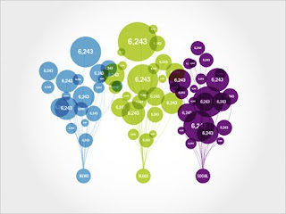
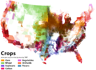
This first infographic depicts google search results, broken down into 3 categories (news, blogs, social). The second represents the distribution of types of crops throughout the U.S. And the third, which I thought was really interesting, is an interactive timeline of all the movies released since 1986. Width is based on weekly box office revenue, length is longevity, and they are colored according to the total amount of money made.


Topic: How dependent I am on technology
Subcategories:
1. cell phone (texting)
2. email
3. social networking
4. ipod/ music
5. movies

I would also like to explore the usages of techonolgy. For example, how often I use it for work, entertainment, and communication (and communication can then be broken down into whether it is instant or delayed). And also looking at how often I multitask (ie listening to music while chatting with someone online)


1. Lost/Misplaced/Forgotten objects
- list of all the things lost in a week
- most common things lost or misplaced
-all things that I have forgotten about
-all things lost that stress me out
- things lost that i have no care for
2. Time
- total time spend searching for objects that I misplaced
sub. category - in a day
in a week
- how many times I loose common things that are lost often
sub. category - in a day
in a week
-total steps taken to search for objects lost
sub. category- in a day
-in a week
3. Places Lost/Found
- where i am when I loose things:
where at home
where at school
where at work
-where do i find them most
other categories:
how many times i find objects in the same place i start looking for,
and how many times i find objects in a completely new location, then where i started searching( and what are the objects)
4. Process of Finding
- what processes do I use to find
-how many times do I use the same logic to try to find things
- do i use some methods twice in a row if the previous on worked before-
which method , when , where, what i was looking for
5. Results 0f all things lost/forgotten/misplaced
-How many times do I find what I loose
- what did I find this week, that I forgot I had or misplaced while:
how many times did I find what I lost while ago
- how many times did I not find anything
- how many times I had to use an alternative because i haven't found what I was looking for.
- average time spend searching for something
-average steps taken to look for something
- total things lost/forgotten/misplaced this week

Sunday, October 25, 2009

Beautiful Info :]


because i know 90% of you just want to look at the pictures:


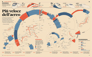
just some of the info graphics i came across while searching the web that i found particularly awesome. i dont know how many we had to post but i hope this is enough. (for those who cant read italian, in the first one theyre basically talking about different brands of transportation)

i also found another blog called the best part...it has some pretty interesting design stuff (and other things too)

also, my five pillars of information are:

1. entertainment (facebook, music, movies, 'family time')
2. travel (mileage, elevator rides, modes)
3. food (breakdown of carbs vs proteins and stuff, how long it takes me to eat/cook)
4. necessities (sleep and shower average times, class time, work time and what it's produced)
5. eccentricities and addictions (coffee/tea count, number of sticky notes written, snooze button smacks, impulsive purchases, number of pamphlets collected)

..et cetera.

for all of the categories i will be displaying the weekly and daily averages. i've decided to focus more on what i did in time, rather than just time. though time will still have it's place in the project, i think its more interesting to point out what happened during that time, and why i choose to do it.
also, i thought this was kind of awesome


Examples and Categories


Brief Explanation of each choice.

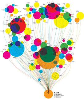
1. This Graphic exemplified an interesting way to keep track of something over time and then visualize the information in a few ways. Including color and density. Could be interesting to have a certain amount of time durations and then visualize from that perspective.

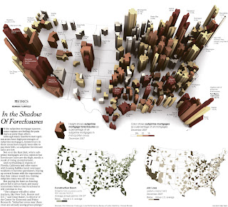
2. Awesome Calendar that showed what the firm's productivity and activity was in a second layer. I really loved the innovation and thought it could be an interesting way to approach phone calls by day with more particular data underneath.

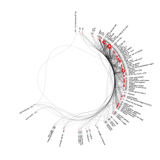
3. Although Super complex this might really be a cool way to visualize all the people I talk to and then show data through density of lines. Duration, frequency of calls, could be well exemplified in this style.

For my Data I would like to have 3 Top Categories (if possible) as I have the most complete data on these categories. (I can work on making 2 more, but they might not be tied in as well)

The three are Dialed Calls, Missed Calls, and Calls Received.
Subcategories might include. Duration, Area Code, Person, Relation, Day, Time (A.M./P.M.), Gender, and Age.

Hope this helps clarify what I'm thinking about.