Tuesday, December 8, 2009

more ideas...

The previous logos felt too heavy, so I changed the condensed bold to light for the lab part as well as the color scheme.
More Radio Lab!

Monday, December 7, 2009

a few ideas!

so here is my attempt at applying what was said last week about the previous logos. Feedback would be awesome!
Two renditions

I know they're a bit small and the arm does weird things at this size, i'll repost in a bit with bigger ones, resizing is doing weirder stuff. Any opinions?
EDIT:
MUCH larger, once again, any opinions?

Wednesday, December 2, 2009

LOGOS

group of designers and illustrators are making prints for radio lab!


Box to Hold the Set

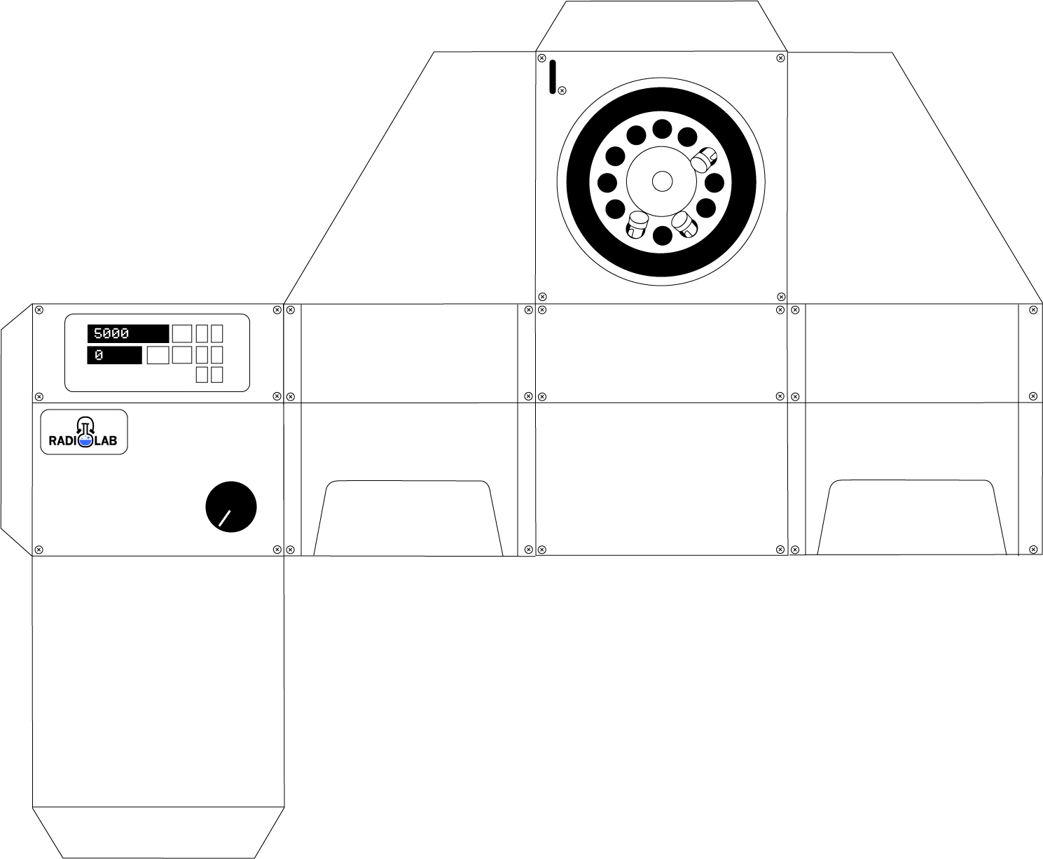
So I was trying to think of lab equipment that I could gear this whole thing toward, and I decided on a centrifuge. If you don't know what it is, a centrifuge is that piece of equipment in the lab used to mix up the content inside test tubes. It's pretty much going to be found in most laboratories, and any science-minded person will know what it is.

Right now, the box is just a simple line drawing. I will try to bring it in tomorrow assembled. However, do you guys think that I should try to render and shade it in in Photoshop, or leave it stylized? Maybe that's too hard to tell on the computer, so I'll just bring it in tomorrow for your opinions. Thanks!


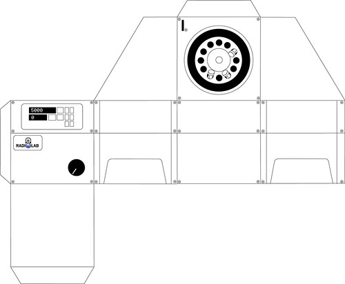
P.S. click the picture for the full-sized image


Very Sciency

I'm not sure about the yellow and the placement of Lab in relatiton to Radio. What do you guys think?

Tuesday, December 1, 2009

Variations


different variations on one idea (i'm still a little iffy on the colors):


Re-Working It


This is my latest version of the movie poster project. I played around with scale and placement. Any feedback would be awesome :] I'm still not sure if the two hats are working properly yet.
Here's my digitized logo for Radiolab.


Saturday, November 28, 2009

Radio Lab First Try

Just some branding for radio lab, one without text,
and one with

Logo


Updated Logo. Sorry for the back-to-back post but I finally found an image I felt was lacking.
I fixed the blur to look like a microscope. Not sure about how much/little of the microscopic "stuff" should be around, the top seems off balance, the bottom is busy.
Thanks

Friday, November 27, 2009

Logo


This is a slightly more refined sketch of my Radiolab logo. I was aiming for the effect of viewing through a microscope, although the blurry parts smoothed out a bit when I uploaded it. Also any thoughts on the odd cellular forms cruising around would be helpful (Im interested in pursuing those as a system for the packaging).
I'm also not sure how I feel about the Radio Lab, as it feels a bit removed from the microscope idea.
As always comments are very appreciated.

Monday, November 23, 2009


So here's what I've been working on.  Not really sure how I feel about the radiowave thing, or how exactly to fit things together.  Feedback would be really great!


This is the radiolab logo I liked the most. Trying out some variations on it. Feedback would be highly appreciated.

Thursday, November 19, 2009

The Lovely Package


The Lovely Package is another great packaging design blog to visit for inspiration.


Wednesday, November 18, 2009

Reboot of my Pictograms

I tried some new things on my pictograms here.


one more to be done.

Tuesday, November 17, 2009

the other side


Heres the other side of the pamphlet. the two panels in the center of the bottom row are the back and front.

Alan Front


Here is my idea for the front. It is myclock pictogram along with all of my other pictograms, along with a pie chart of work and leisure results.

Alan 8 Fold


I'm still playing with placement in the middle, of the bar graphs and pictograms. If anyone has any ideas all i'm all ears.

Monday, November 16, 2009

Large back panel of pamphlet

Here it is so far, feedback is really appreciated!

Thursday, November 12, 2009

Silkscreen and Blank CD & DVDs


5inch.com has an amazing variety for inspiration and also materials. You can buy blank hubs, cases and CD/DVDs.

Wednesday, November 11, 2009

Just for the sake of posting, here's two previews of my work in progress in color. I haven't updated my content or non-content pictograms yet, so the ones that are there are just placers. This is a cartoon character that I always use for myself so I thought it would be cool to use it for my pictograms. I know I still need to add two more panels but I couldn't figure them out yet. Also, I thought it would be funny to add quotes to each category - that is, if they will fit on the page... it's pretty small. Anyway, here goes.

Neat Seven Deadly Sins Infographic


http://www.lasvegassun.com/photos/galleries/2009/mar/25/seven-deadly-sins-nationwide/

Rough 8 panels


This is probably coming a bit late, but feedback helps at any point. Anyways here is my rough outline for the 8 panels. I'm still not sure how I'll fold it, I had ideas but I'm not sure anymore.
One problem I keep running into is Graphs that are vertcial are really killed in a horizontal panel, so i may end up trying to fold it so that vertical panels can be aligned together, as well as horizontal. Maybe making a 4/4 set up. I'm not sure if you can see it, but there is light text of my data in the intro and I wasn't sure if I should have it in only a single panel. Thanks for the help!

Tuesday, November 10, 2009

Revised Pictograms


I fixed my pictograms and added some color (not sure about it though, it might be changed once i figure out my color pallet for the pamphlet.)
Here's my first draft of my back panel. I am not really sure how I feel about it.
I was trying to use scale and transparency to rate how often I used each mode of transportation, and at the same time show location. I'm not sure if labeling it with numbers and percentages is necessary for understanding or required in the assignment.

Monday, November 9, 2009

My new pictograms! wahoo

I am thinking about getting rid of the whole arrow motif all together just to make my pictograms simpler, that way they only symbolize one simple thing when it comes to creating the more complex infographics. I am a little worried that my overall transportation icon sticks out now because it's the only one with arrows...

I also attached a sketch with a bold arrow behind the picto just to give you an idea of what they look like with an arrow behind.